
You’ve spent hours refining your landing page. The copy is clear. The offer is strong. The value prop is undeniable.
So why aren’t people clicking?
The problem might not be the offer itself—it might be that no one sees it.
In the battle for attention, visibility beats value. And in today’s noisy, scroll-heavy world, even the most compelling call to action (CTA) can disappear into the background if it’s poorly placed, weakly styled, or visually deprioritised.
Let’s break down why invisible CTAs are one of the most expensive design mistakes—and how to fix them.
When “Great” CTAs Fail
Here are three examples of how high-performing offers become under-performing assets simply because users don’t visually notice them:
Example 1: Below-the-Fold Blindness
A discount code (“Get 20% Off Today Only”) was placed under a testimonial carousel and beneath a long product description.
Result: The CTA was technically live—but never seen by 72% of users in heat-map tests.
A good CTA in the wrong location is just digital clutter.
Example 2: Competing Visual Noise
A landing page with multiple buttons—“Learn More,” “Try the Demo,” “Book a Call”—presented them in the same colour and size.
Result: Users skimmed past all of them, unsure which was most important.
Visual hierarchy matters. If everything’s emphasised, nothing stands out.
Example 3: Poor Contrast, Great Offer
A white “Sign Up Now” button placed on a pale background. No border, no hover state.
Result: CTA completely missed during eye-tracking tests.
If it blends in, it disappears—no matter how powerful the message.
Why Invisible CTAs Are So Costly
Let’s be clear: You’re not just losing a click. You’re losing:
- A conversion
- A potential lead or sale
- The ROI on your traffic spend
- The credibility of your offer
If you’re running paid media, invisible CTAs are like pouring money into a bucket with a hole in it. Even organic pages suffer—great content is wasted if users don’t know what action to take next.
How to Make CTAs Unmissable
Here are four data-backed strategies to improve CTA visibility and effectiveness:
1. Run a Visual Attention Test Pre-Launch
Use predictive eye tracking to simulate where users will look. If your CTA doesn’t land in the heatmap’s focus zone, move it, enlarge it, or restyle it.
2. Simplify Surrounding Elements
Reduce distractions. Limit competing CTAs. Use white space to give your primary button room to breathe.
3. Improve Visual Contrast
Make sure your CTA colour contrasts with its background. Add subtle animations or hover effects to draw the eye.
4. Reinforce the CTA Earlier
If your CTA is near the bottom, preview it higher on the page. Give users a reason to scroll by highlighting what’s coming.
Before You Launch, Test What People See
You can’t fix what you can’t see. That’s where Re4m comes in.
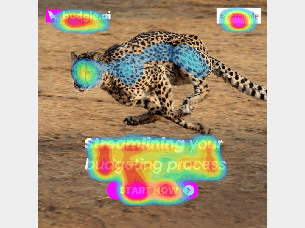
Re4m uses predictive eye tracking to simulate how real users visually engage with your page—before you publish.
In just minutes, you can identify if your CTA is:
- Being ignored
- Overshadowed by other elements
- In the wrong position
- Under designed or misaligned
Don’t guess. Test. Adjust. Perform.
Make It Seen, or It Won’t Sell
The best CTA is the one that gets clicked. And to get clicked, it must be seen.
Invisible CTAs cost more than clicks—they cost conversions, credibility, and campaign results. But with the right attention data and design practices, you can make every call to action count.
**Run a CTA heatmap on your next landing page with **Re4m.io and see exactly what your users will notice first—before you go live.